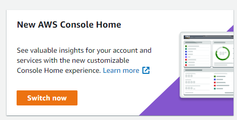
On 12th January 2022, AWS announced a new AWS Management Console home page. I think it’s a step in the right direction. Here’s why.
Old console home page
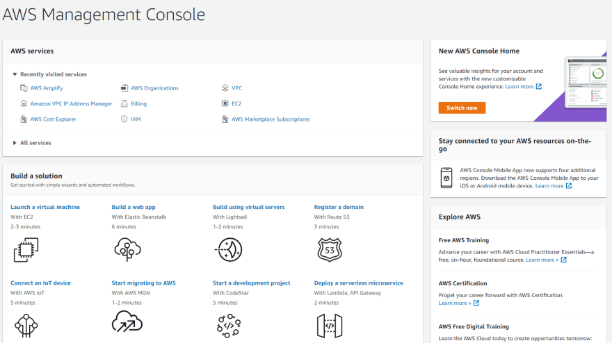
Lack of Customization
In the old console home page, you had a lack of customization. You cannot move, resize, remove any elements on the console page. The only thing you could customize is a bookmark of your favourite AWS services.
No Consolidated Dashboard
Although there are dashboard features found in a couple of AWS services, there isn’t a customizable multi-service dashboard. For example, in the EC2 and RDS console page, you have the EC2 and RDS dashboard respectively.
Bloat (for experienced users)
The old console home page contains a lot of content meant for new users. For experienced users, majority of these content are bloat, diluting the overall console home experience. An example of bloat:
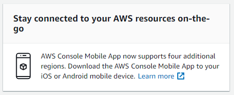
Other bloat content includes boxes for “Getting Started” and “Explore AWS”, which is hardly ever used for an experienced user. This issue can be solved if customization allowed these bloat content to be removed.
What’s on the new Console Home?
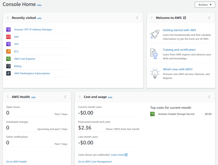
At launch, users can utilize 8 widgets. I will list all of them down below, along with a simple description, my personal recommendation and a rating as an experienced user.
- Welcome to AWS
- Includes links to learn fundamentals of AWS, training, certification and AWS news. Widget only available in 1 size.
- Basically useless for experienced users. Will benefit new users accessing the AWS console for the first time.
- 2/10. Remove it!
- Recently visited
- List of AWS services you’ve recently visited. Widget available in Regular or Extended views. Has pagination in the regular view.
- A frequently used part of the old console home page. Hard to find faults with this.
- 8/10. Pretty useful.
- AWS Health
- Contains events that might affect your AWS infrastructure and account. Widget only available in 1 size.
- Not really useful for solo developers or beginners. Very useful for enterprise customers with huge infrastructure.
- 5/10. Must have for enterprise users, mostly useless for everyone else.
- Cost and usage
- Visualizes your AWS costs and usage. Contains information on your current, previous and projected month’s costs for the Regular view. Includes a cost breakdown for a few of your top spending AWS services in Extended views.
- Extremely useful for all types of users. New users can spot unterminated cloud resources, enterprise users can get a quick sensing of cloud spending trend. Recommend to set this at Extended View.
- 10/10! The runaway winner of this new console home page change.
- Build a solution
- Workflows and wizards that introduce you to AWS services. Widget available in Regular or Extended views.
- Mostly unused and a big part of the previous bloat problem. Usually not the first place experienced users look at when thinking of solving a problem. Might benefit new users more.
- 3/10. Probably should remove.
- Trusted Advisor
- Mainly for accounts with AWS Business Support or AWS Enterprise Support. Can see an overview of automated checks from Trusted Advisor. Widget available in Regular or Extended views.
- Practically useless for accounts on Basic (free) and Developer support plan. Benefits enterprise customers with sizeable cloud infrastructure spending.
- 5/10. Must have for enterprise users, mostly useless for everyone else.
- Explore AWS
- Contains AWS training and certification links. Widget only available in 1 size.
- Useless for experienced and enterprise users. Hard to see beginners use this as well. Seems to overlap with Welcome to AWS widget.
- 1/10. Remove it immediately!
- Favorites
- Shows the AWS services that users bookmarked. Widget available in Regular or Extended views.
- Pretty useful all around, more so for enterprise and experienced users. New users will probably utilize the Recently visited widget more often.
- 7/10. Less often used than Recently visited, but still a mainstay for most users.
What I want to see in the future?
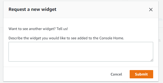
The more widgets there are, the more customizations there will be. The new console page does have a nifty little link for users to submit widget suggestions (see screenshot below). I would also be interested to have more options to resize the widgets.
I hope that individual service dashboards, for example, the EC2 dashboard, can be made into a widget. It could also be extra helpful for Ops folks if Cloudwatch dashboards can be exported as widgets on the home page.
Lastly, I want the ability to share home page configurations across AWS Organizations or different accounts. I feel like that would be helpful for users managing more than 10 AWS accounts.
Closing Thoughts
Historically, AWS console home page have been lagging behind Azure and Google Cloud. This change is a step in the right direction and definitely has an immediate positive impact for enterprise and experienced users. So, enable the new console home page experience right now!

Let me know what you think. Don’t forget to follow me on LinkedIn.
